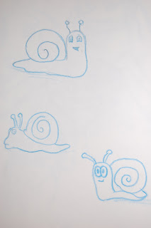
Here is my 2d flash lip sync animation.
This was my first animation I have made in flash so I am still getting used to using it. I thought that the actual lip sync worked well but the characters were too static. I think I should have made the characters interact with each other more other then blink and looking at each other.
Here is a still from the animation.
Tuesday, 16 March 2010
Environment project.
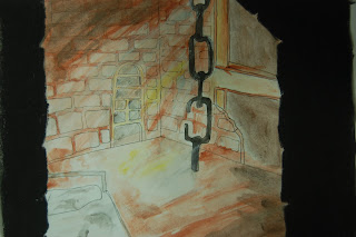
We were asked to create an indoor 3d room for our environment project, To start off with I decided to create the dungeon scene that I had made for my background project. I spent a few days modeling the scene and began to texture it before deciding that I wasn't pleased with it and moving on to a different scene. I couldn't get the texturing right on it and I felt that there was too little in the actual scene.
I decided to move onto something that would be a little more challenging so I thought that I would try and model my flat. I did a quick sketch of the objects in the flat that I would want in my scene.
Once I had textured my scene I then went on to lighting it which was harder then I had first anticipated. I ended up using 44 lights in the scene to get the lighting how I wanted it. I used an ambient occlusion to bring out the detail which causes further problems as my scene was fairly dim I had to do the ambient occlusion a few times as when i merged it with my final render in photoshop it was too dark , the renders for the ambient occlusion took about an hour each time and I had to render it about 5 times to get the brightness I wanted.
Here is the final render.
Friday, 19 February 2010
Flash character lip sync.
For our flash project we have been asked to create an animation using lip sync. We have to create our own characters and fit the lip sync to an audio clip provided.
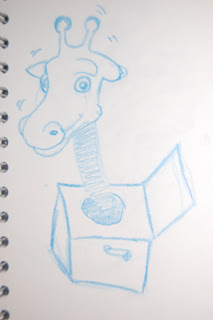
Here are some of my initial ideas for the animation and the characters. After listening to the audio clip i decided that i would like to create some characters based on animals. I tried out a few ideas using giraffes and spiders to start with.After listening to the clip again i though that the spiders would not fit the softer voices in the sound clip.
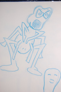
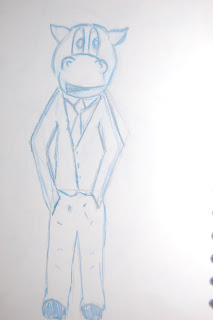
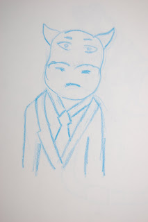
I had an idea using inspiration from one of our earlier motion studies projects of using the animal heads with a human form.
I really like the idea of using the hippo in a suit as it is an unusual contrast between the idea of this wild creature in a civilised fashion. I wanted to create another character to use as there is more then one character talking in the audio clip. I thought that it would be a good idea to have a smaller creature like a snail.
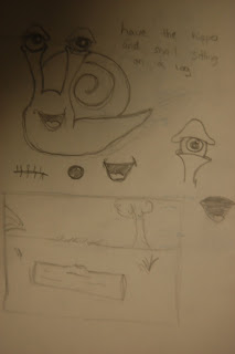
I like the idea of having these two animals on different ends of the size scale. I want to have them talking to each other maybe sitting on a log.
I had ago at a background design for the animation, I want to have them sitting up in a tree facing the camera. I am now going to carry on with the designs and create the characters in flash.
Here are some of my initial ideas for the animation and the characters. After listening to the audio clip i decided that i would like to create some characters based on animals. I tried out a few ideas using giraffes and spiders to start with.After listening to the clip again i though that the spiders would not fit the softer voices in the sound clip.
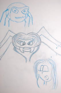
I had an idea using inspiration from one of our earlier motion studies projects of using the animal heads with a human form.
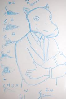
I really like the idea of using the hippo in a suit as it is an unusual contrast between the idea of this wild creature in a civilised fashion. I wanted to create another character to use as there is more then one character talking in the audio clip. I thought that it would be a good idea to have a smaller creature like a snail.
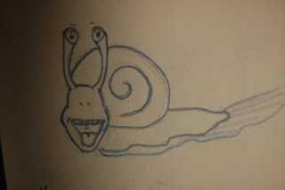
I like the idea of having these two animals on different ends of the size scale. I want to have them talking to each other maybe sitting on a log.
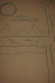
I had ago at a background design for the animation, I want to have them sitting up in a tree facing the camera. I am now going to carry on with the designs and create the characters in flash.
Thursday, 18 February 2010
Animation Background.
We were asked to create 3 animation backgrounds, the first being an exterior pencil layout with some tone, the second was an exterior background using a specific colour palate and the third was an interior background with a light source.
To start off with i couldn't really get into the project which meant a few hours wasted staring at a blank page struggling to come up with ideas.
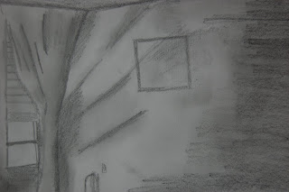
Here are my 3 final designs, I wanted to use a monochromatic colour palate so I decided to use blue to create a feel for night . I was pleased with how these turned out but I would like to learn how to colour on photoshop using a graphic tablet.
I also did some sketch book work playing around with ideas and composition, i also experimented with some colour and different mediums.
Live at 5.
We started our live at 5 day with a meeting where we assigned the role of
producer to Hugh and talked about how we were going to split the tasks up
between the group.
At 10:15am we were visited by two people from the live at 5 crew who
talked to our producer about what they needed. We were given the task of
creating a weather map for two days and they asked for it to be created by 11:00
am which gave us 45 minutes to complete it which we were unaware at the time
would be unrealistic, as we had to create everything from scratch, we used the
first 10 minutes for gathering our ideas and then the rest of the morning was a
frenzy to get the work completed on time. I was to create a basic map of Cornwall
in Flash, whilst Hugh, Tom and Darrien worked on Photoshop creating weather
symbols for frost, light showers, snow showers, sunny spells and North. ‐
Western winds. we decided that we should only label the key towns in Cornwall
so the map would not be too busy and easy to read. First of all I decided to use
flash to put the names of the towns on the map but when I exported it as a png
file the names that were not within the actual map had a black box around them,
so I had to go back and remove the names from the map. I had a few more
problems when creating the map as Flash kept crashing. Once I managed to
create the map I coloured it and added a glow then exported it to After Effects.
Once we had created all the elements for our map we imported them into
after effects. I put the map into 3d space and duplicated it so there would be two
layers. I then made the bottom layer black so the map would look 3d. We added a
camera so we could add motion to it. We worked out how long it would take to
say the dialogue that we had been provided with so we could match the weather
icons to appear roughly as the weather reporter would say them. We then added
an animated Aston that Oli had already created with today and tomorrow
written on for the two days of different weather and added a nice spreading frost
effect to the second map. We did however have some problems when creating
the animation in After Effects as we kept loosing files when we were rendering
so it took longer to make then we had anticipated. The whole animated map
took about an hour and a half to create and as most of our group had little
experience in after effects so animating it took about another hour to finish.
Overall I think that the graphics for the weather looked fairly professional and
the animation on it was fairly simple but appropriate for a News programme.
We also had to create a surf report that Oli started to work on when we
were creating the different components for the map. He made 2d waves and had
the camera zoom through them onto a moving surfboard. We then added the
information that we had been provided with for the high tides in Falmouth and
Newquay. The only real problem we had with this part was when we went to
export it; it took 25 minutes, as there was a motion blur effect on the file.
Liam Fraser Digital Animation.
We handed the final renders of the weather maps and the surf report to
the members of the live at 5 crew at 12:30 pm and waited for more graphic
requests. We received a request for a short video for a virus story they were
running. Our producer Hugh worked on this and had it finished quickly with
much delight to the live at 5 crew who had been waiting around for the weather
maps.
We were then asked for Astons, which we already had prepared, that
fitted the title sequence that Oli had created. We offered them animated Astons
but they said that they would rather be still images, there were a few problems
with the size of them to begin with as they needed to be smaller.
After that we didn’t receive any more graphic request so we were left
waiting around to go watch them record the show. I really liked seeing how our
work was being used and it was nice to see it all come together. We noticed that
they had cut the surf report when they used, we didn’t really see a need for it to
be cut down, as it was not very long to begin with. I also think that there were
plenty more chances in the show that they could have used us to create graphics.
Overall I though that the day was a success, however I would have liked
some more work as the manic couple of hours in the morning quickly fizzled out
into waiting around with no work to do. I liked that we had to work fast under
pressure with the unrealistic timeline and it really gave me a feel for how
working in a real studio would be. I just wish we were like that for the whole day
as there were plenty of opportunities in the show that they could have used us.
Weather Today map.
Weather Tomorrow map.
Live at 5 idea 1.
Live at 5 idea 2.
Motion studies.
We were given a project where we had to capture the essence of movement in our drawing. Observing peoples movement but with a twist. We had to use animal heads on the characters so we wouldn't get too focused on detail. To start off with I couldn't get into the project but once i sat down and started working on it i started to really enjoy it. I liked finding the heads to match the poses of the body and I think that some of them turned out really well.
Subscribe to:
Posts (Atom)